
Average rating of the 15-minute interval (AQH, Average Quarter Hour)
General information
The report shows the number of listeners of the selected radio stations in each 15-minute interval. While the listener falls into the range only if he listened to the canal in its entirety or started listening in the previous interval, finished in the current one, or the entire listening falls into the range.
The AQH report is one of the generally accepted reports of the radio station. If the AQH of a radio station is equal to 105 thousand people, it means that on average at least 5 minutes during a 15-minute interval, 105 thousand people listen to this radio station.
The AQH report is one of the generally accepted reports of the radio station. If the AQH of a radio station is equal to 105 thousand people, it means that on average at least 5 minutes during a 15-minute interval, 105 thousand people listen to this radio station.
To see how the audience is involved in a particular 15-minute segment of the broadcast. The data can then be compared, for example, with a grid of programs.
That is a generally accepted report that shows the involvement of listeners in a particular 15-minute segment of the broadcast. For example, in the comparison mode, you can select two days when the same program was on the air and then compare the audience engagement.
That is a generally accepted report that shows the involvement of listeners in a particular 15-minute segment of the broadcast. For example, in the comparison mode, you can select two days when the same program was on the air and then compare the audience engagement.
Why do you need this report:
The report supports operation in comparison mode. In this case, the columns for stations are not displayed on the graph, and only the total lines for both selected intervals remain. The ethereal grid in comparison mode is displayed in the form of two columns, one for each interval. To display it at the desired interval, you need to click on the point of the graph. Similarly, only the total columns for the intervals between which and the percentage ratio is calculated remain in the table with the data.
Features:
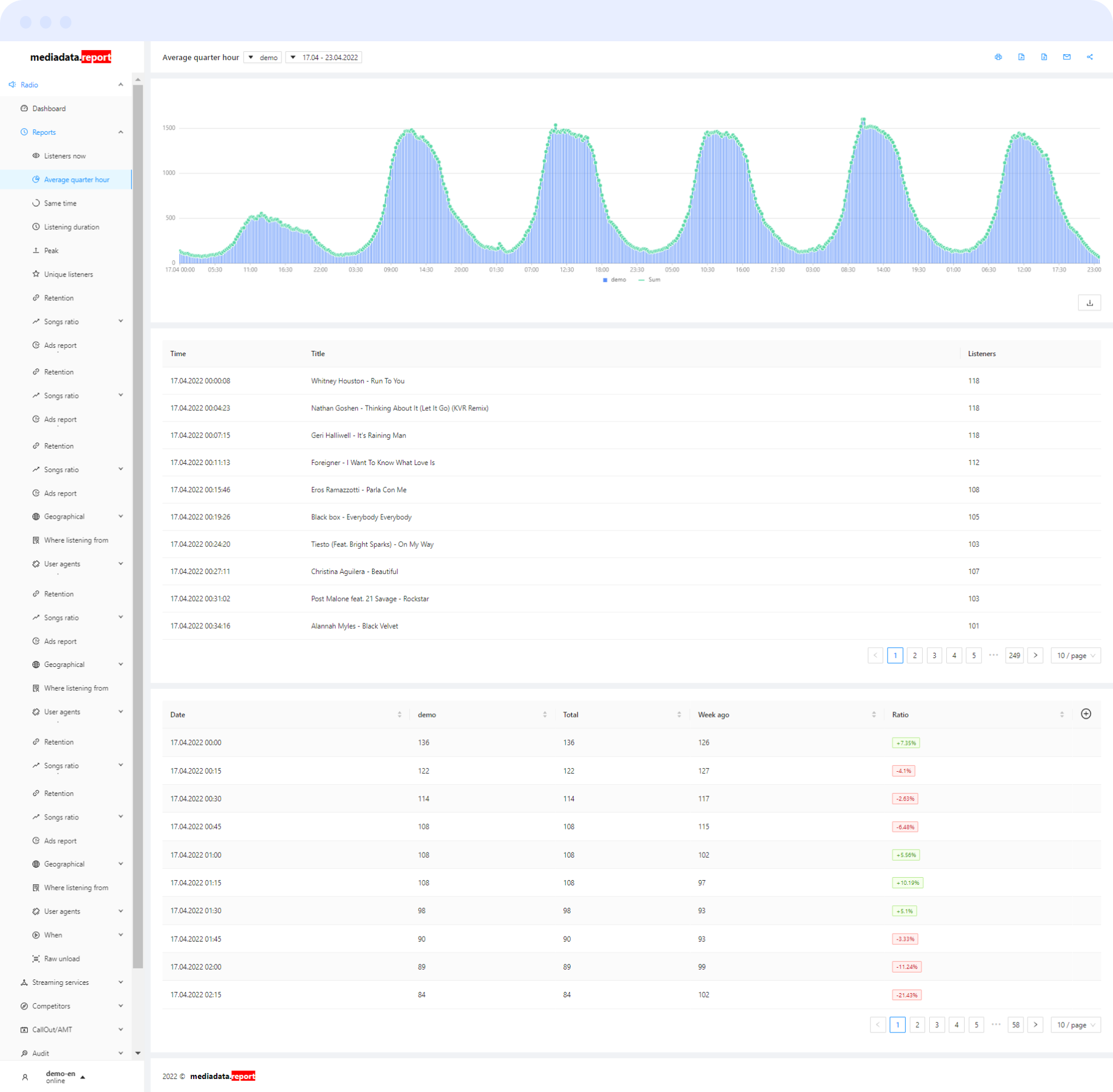
It consists of three blocks: a graph, an broadcast schedule and a data table.
The intervals are shown as columns on the graph, one for each station, showing the number of listeners in the interval. The total number of listeners for all selected stations is plotted above the columns in the form of a line.
Broadcast schedule allows you to view the ethereal elements that were played in the selected interval. By default, the broadcast grid displays the entire broadcast of the selected period. To display a specific interval, click on it on the chart. The broadcast grid will not be displayed if more than one station is selected.
The data table displays the number of listeners in the interval for each station, the total number of listeners, the total number of listeners for selected stations a week ago, and the percentage of current data to data from a week ago.
The report consists of: